Studio Builder
The Dashboard Builder is the web portal where dashboards are authored — no JSON by hand, no deploy. Reach it from Settings → Dashboard Builder.
Access is gated to system-record users.
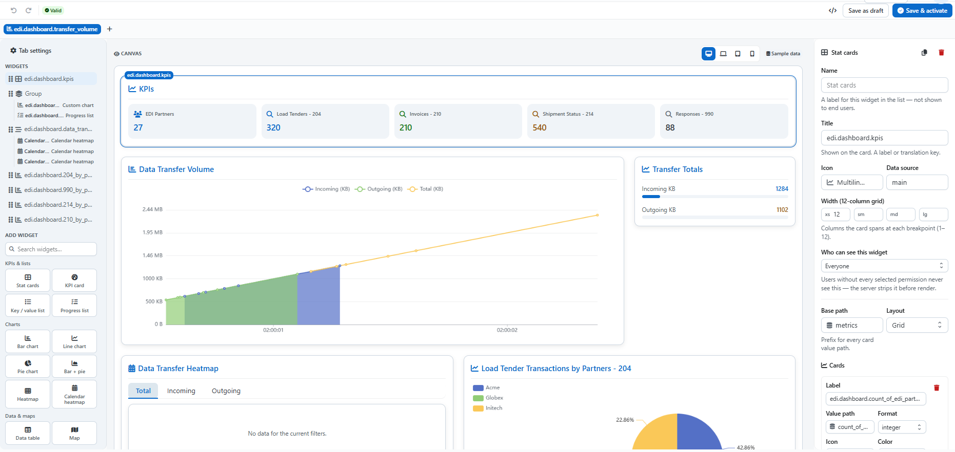
The layout
Five regions, and you'll use all of them on every dashboard.
| Region | What it's for |
|---|---|
| Top bar | Undo / redo, the validation chip, JSON tools, and the two save buttons. |
| Tab strip | One chip per dashboard tab. Drag to reorder, + to add. |
| Left — Widgets | Tab settings at the top, then the widget list in render order, then Add widget. |
| Canvas | A live preview you click and drag directly. |
| Right — Inspector | Everything about whatever is selected. |
Left pane
Tab settings opens the tab-level editors: title, icon, permissions, and the Data sources, Filters and Actions lists.
The widget list shows the tab's widgets in render order. Drag the handle to
reorder — canvas order is display order. Nested widgets (a group, a
tabbedGroup) show their children indented beneath them.
Add widget is a searchable palette in five categories:
Canvas
The canvas is the real dashboard renderer, not a mockup. Two things to know:
The Sample data chip is a reminder, not a toggle. The Builder never calls live endpoints, which is what lets you lay out a dashboard before its backend exists. Shapes and layout are real; the numbers are fixtures.
The viewport toggle edits one breakpoint at a time. Resizing a widget while
simulating Tablet writes the sm span and leaves the others alone:
| Viewport | Breakpoint edited |
|---|---|
| Desktop | lg |
| Laptop | md |
| Tablet | sm |
| Phone | xs |
Click a widget to select it; drag its edge to resize. On an empty tab, the canvas offers starter templates matched to the app mode.
Inspector
With nothing selected, the Inspector shows Tab settings. With a widget selected, it shows the common fields first, then that widget type's own form.
| Field | Notes |
|---|---|
| Name | Internal label for the widget list. Never shown to end users. |
| Title | What users see — a label or a translation key. |
| Icon | From the icon picker, which only offers real names. |
| Data source | Which of the tab's sources this widget reads, usually main. |
| Width | Columns spanned at each breakpoint (xs sm md lg), out of 12. |
| Who can see this widget | Permission codes. Users missing one never receive the widget — the server strips it before render. |
Below that come the type-specific fields — for stat cards, that's the base path, the layout, and the card list.
Two Inspector conveniences:
- Duplicate / delete icons sit at the top right of the panel. Build one chart fully, duplicate it, and change only the label, paths and color.
- Path fields suggest paths discovered from the app mode's sample fixture. A suggested path is guaranteed to render something on the canvas.
Widget types without a registered form fall back to a JSON editor, so nothing is ever un-editable.
Top bar
| Control | Behavior |
|---|---|
| Undo / redo | Ctrl+Z / Ctrl+Shift+Z (also Ctrl+Y). |
| Validation chip | Live server check, debounced. Click an issue to jump straight to it. |
| Unsaved chip | Appears whenever the buffer is dirty. |
JSON tools (</>) | View, copy, download, or paste-and-apply the whole config. |
| Save as draft | Saves without activating. |
| Save & activate | Saves and makes it the live config for that scope. |
Keyboard shortcuts on the canvas: Ctrl+D duplicates the selected widget, Del
removes it, Esc deselects. All are ignored while you're typing in a field.
Leaving with unsaved changes prompts first.
What save does
Validation runs server-side before anything is written, and an edit never overwrites the old config — it inserts a new revision.
Validation — what blocks a save
The Validator is a pure data check that returns two kinds of issue:
Errors block the save. They fall into four groups:
| Group | Examples |
|---|---|
| Structure | version isn't 2; tabs missing or empty; a tab with no key, no label, or no widgets; inheritDefaultTabs outside none / prepend / append; an $inherit missing from or key. |
| Duplicate keys | Two tabs sharing a key, or two widgets sharing a key within one tab. |
| Broken references | An unknown widget type; a source or $ref naming a data source the tab never declared; a filter whose options name an undeclared source. |
| Missing required fields | A data source with no endpoint; an endpoint or target that isn't an in-app path; an unknown action kind, or one missing its required field; a filter with no key or type; stat cards with neither cards nor a dynamic-cards path; a malformed CSV spec. |
Warnings are advisory — they show in the Builder but never block a save:
- More than one data source on a tab
- A non-container widget with no source
- An unknown formatter function
- An
$inheritpointing somewhere other than the default config
Icon names and permission codes. Both are guarded by the Builder's pickers, which only offer real values — so if you build normally, you can't get them wrong.
A config pasted in through JSON tools skips those pickers. A bad icon is harmless (you get a placeholder), but a permission code that matches nothing silently hides the element from everyone.
Where the code lives
Frontend file map — web/app/components/dashboard/builder/
| File | Responsibility |
|---|---|
DashboardBuilder.tsx | Setup ↔ studio, top bar, validate, save |
GuidedSetup.tsx | Name, app mode, company, inheritance |
Studio.tsx | Tab strip · palette · canvas · inspector |
Inspector.tsx | Common chrome, delegates to forms/ |
useBuilderState.ts | Editable buffer, undo/redo, config assembly |
sampleData.ts | Fixtures for the canvas and path suggestions |
templates.ts | Starter layouts for an empty tab |
forms/ | Per-widget forms, registered in WIDGET_FORMS |